This guide walks you through the Agentic BI interface. By the end, you will know how to navigate the Dashboards workspace, connect a data source, configure and generate an AI-powered dashboard, create and configure charts, manage your layout, and share your dashboard with your team.Documentation Index
Fetch the complete documentation index at: https://docs.ideaboxai.com/llms.txt
Use this file to discover all available pages before exploring further.
Dashboards workspace
The Dashboards workspace is your primary environment for building and managing data visualizations. It combines a dashboard tab list, a central canvas area, chart controls, and a global create action — all accessible from the main navigation.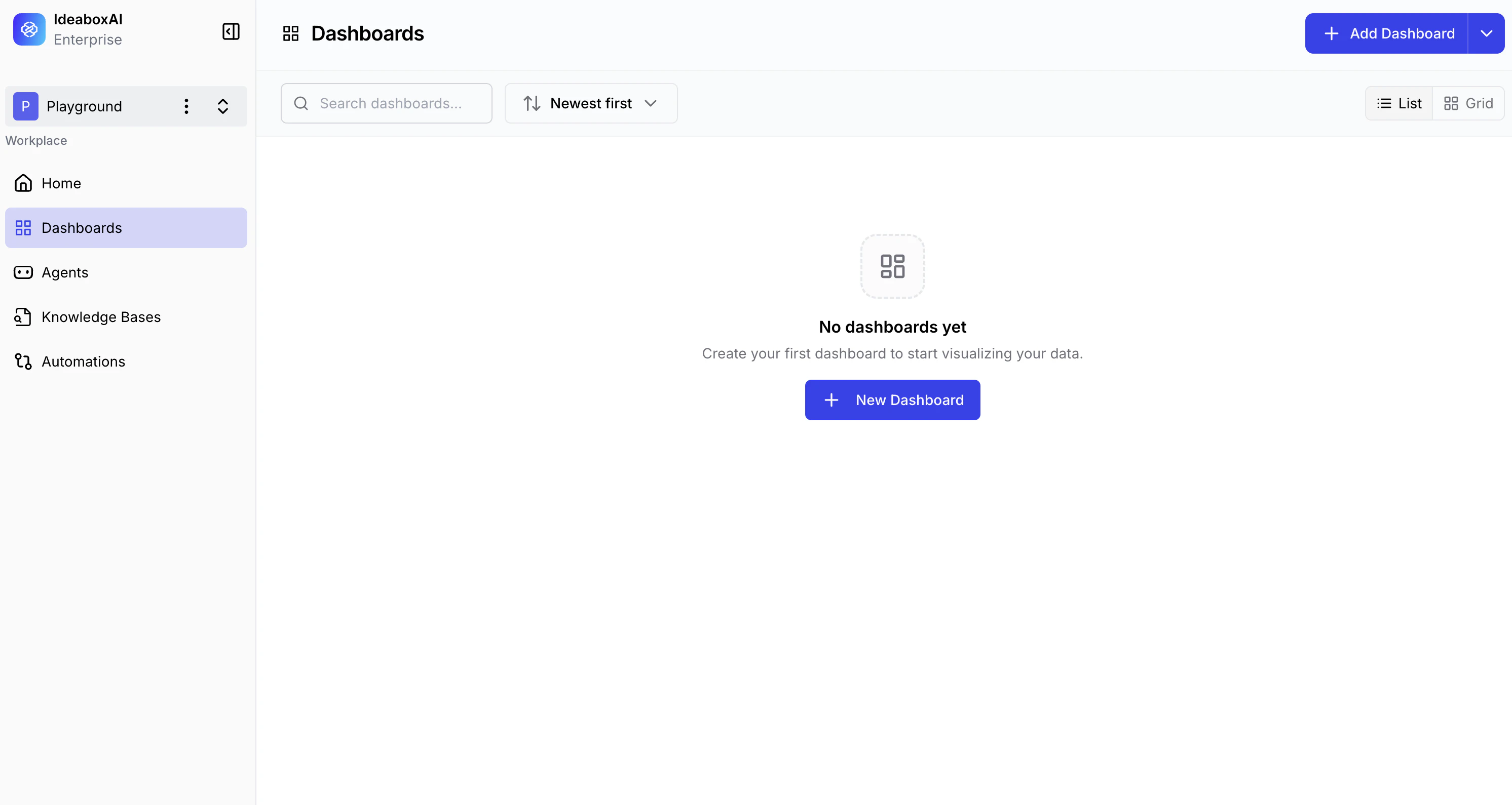
Primary sidebar
The left-side navigation panel provides access to all platform modules.- Dashboards — Your current location. Lists all dashboards in the workspace.
- Agents — Access AI agents configured for your organisation.
- Knowledge Bases — Manage structured and unstructured data connections.
- Automations — Configure automated workflows and triggers.
Dashboard tab list
Existing dashboards are displayed as a horizontal tab list at the top of the canvas area.- Switch dashboards — Click any tab to load that dashboard on the canvas.
- Contextual menu — Click the three-dot icon next to any tab to access Rename, Duplicate, Edit, and Delete options.
Canvas area
The central workspace where charts and data visualisations are displayed and arranged.- In an active dashboard, the canvas shows your generated charts and KPI cards.
- In a new, empty dashboard, a central + Add Chart button is displayed to prompt your first visualisation.
Global action button
A + Create Dashboard button in the top-right corner opens the setup wizard to begin creating a new dashboard.Organise dashboards by business function — for example, Supply Chain, Sales, or Finance — for easier navigation and better team collaboration.
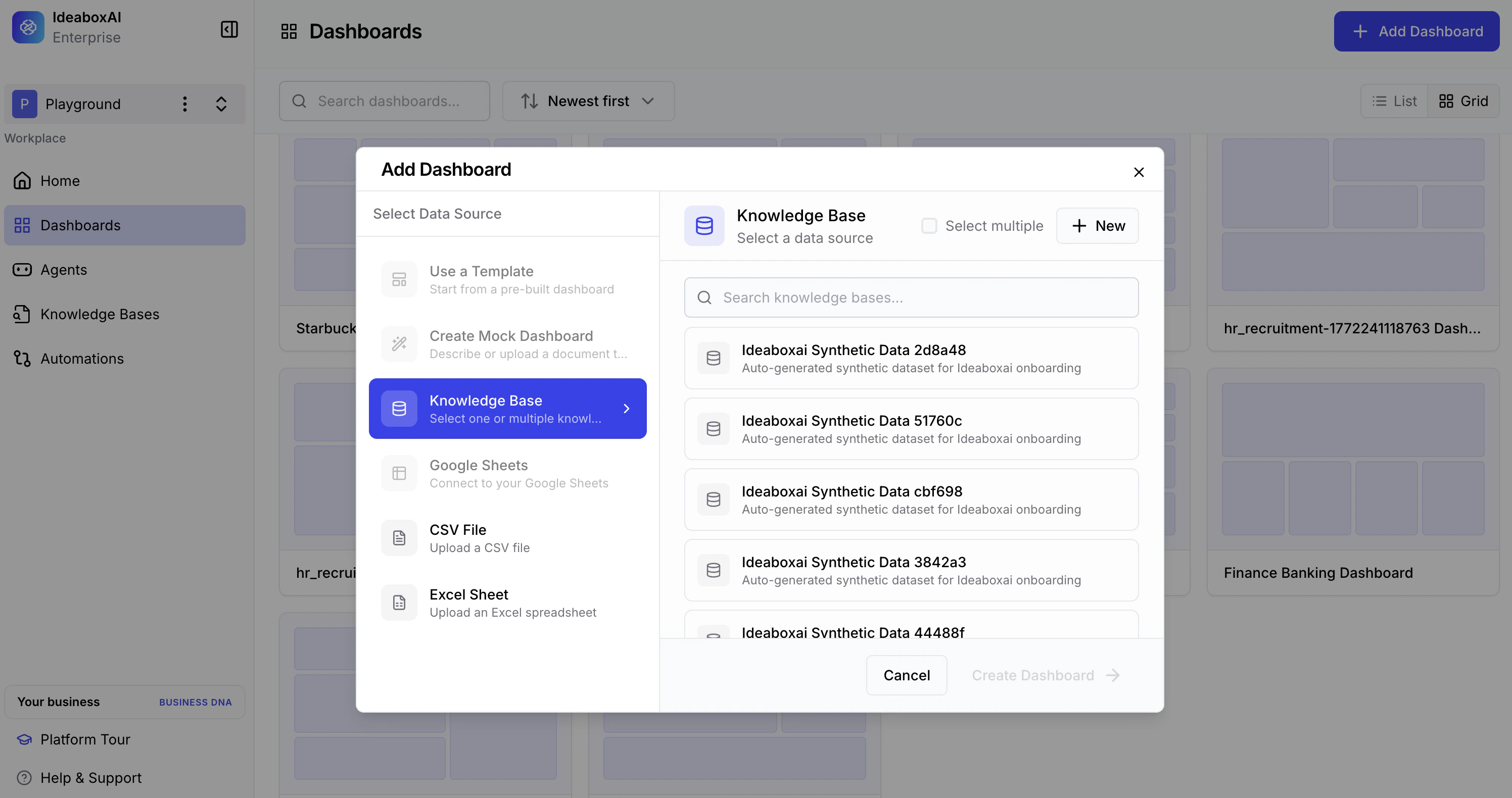
Connecting a data source
When you click + Create Dashboard, a Connect Data Source modal appears. You must select a data source before the AI can generate your dashboard.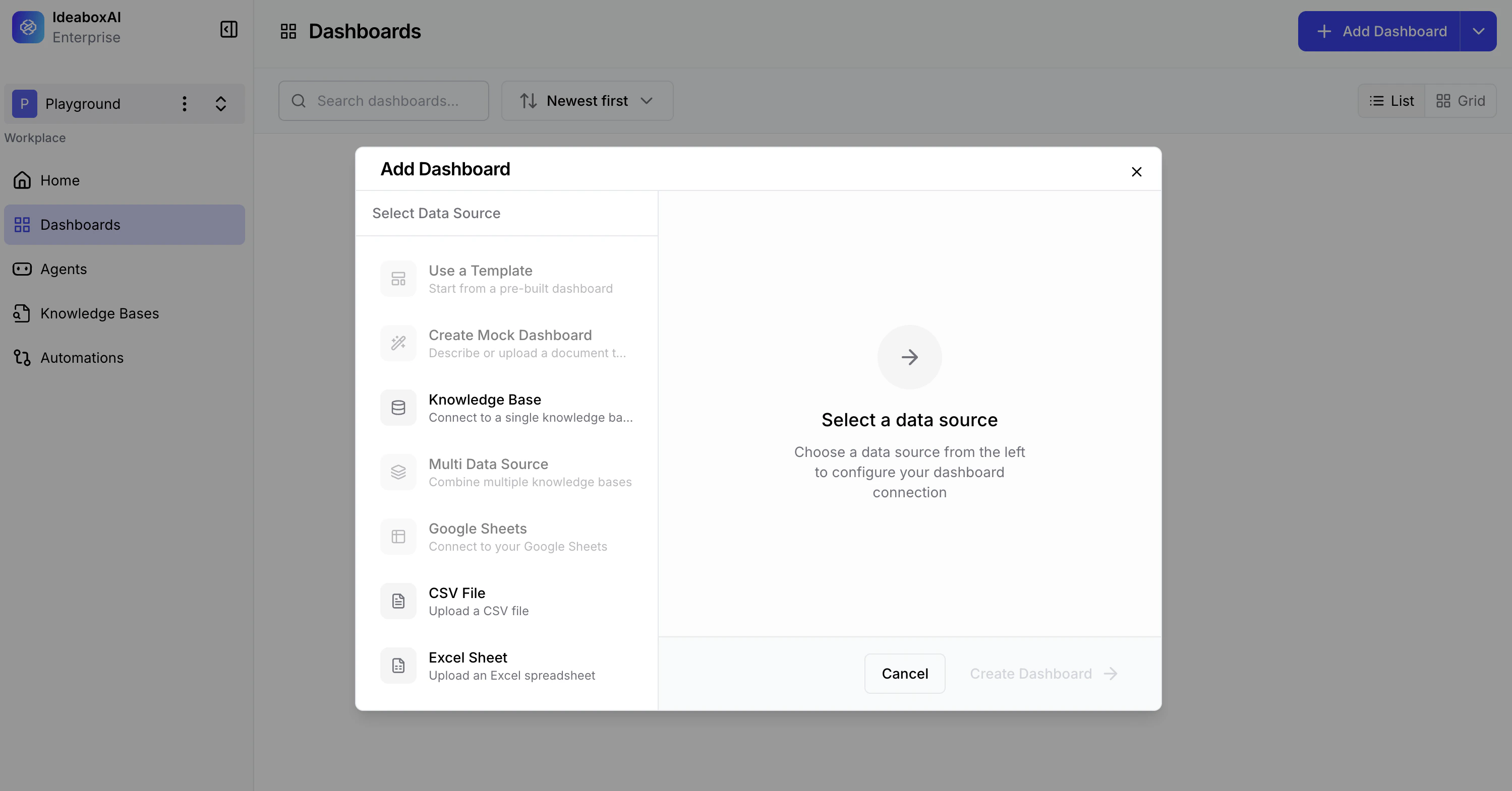
| Option | Description |
|---|---|
| Create Mock Dashboard | Generates a board with sample data for testing and familiarisation. |
| CSV / Excel File | Upload a .csv, .xls, or .xlsx file directly from your device. |
| Google Sheets | Connect a cloud-based spreadsheet. (Coming soon) |
| Knowledge Base | Connect to a pre-configured Knowledge Base backed by a live database. |
Ensure CSV and Excel files are cleaned and formatted with clear column headers before uploading. Poor data quality will affect the accuracy of AI-generated insights.
Configuring your dashboard
After connecting a data source, the Dashboard Configuration screen appears. This is where you name your dashboard and choose how it will be built.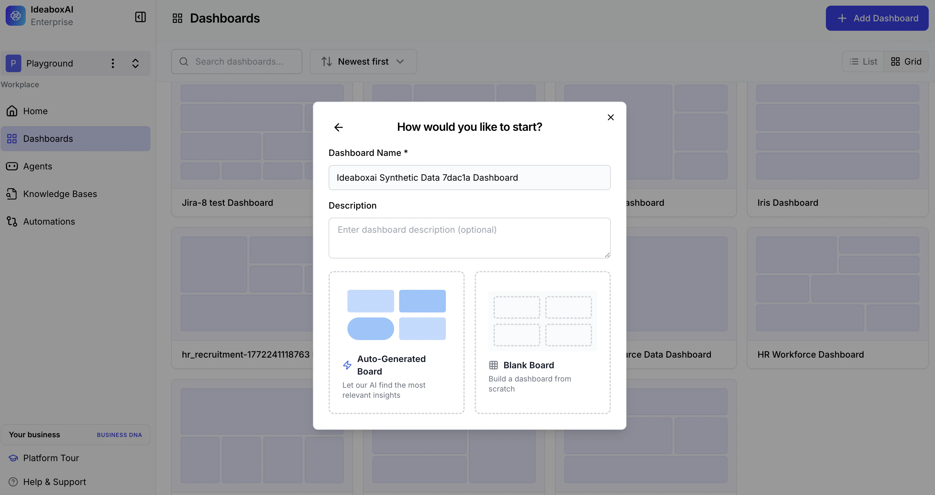
Identity fields
- Dashboard Name (required) — A descriptive name for your dashboard.
- Description (optional) — Explain the purpose and intended audience. This helps the AI tailor visualisation complexity.
Starting options
You have two distinct paths for building your dashboard.| Option | Description |
|---|---|
| AI Builds First (Auto-Generated Board) | AI analyses your data and automatically selects the most relevant charts, KPIs, and layout. Recommended for first-time use. |
| Start Manually (Blank Board) | Begin with an empty canvas and add charts individually using AI-assisted or fully manual configuration. |
Custom instructions
When AI Builds First is selected, a Custom Instructions text area appears. Use this field to guide the AI’s focus.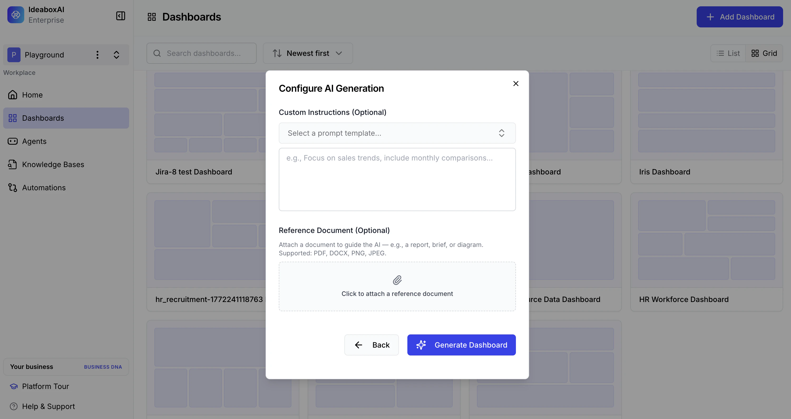
“Track unshipped orders and container status using donut charts. Show inventory distribution by vendor and highlight critical shortage alerts.”
Be specific in custom instructions. Mention exact KPIs and preferred chart types — for example, “Show revenue by region as a bar chart” — to improve AI accuracy and reduce the need for manual edits after generation.
Generating your dashboard
Once you submit your configuration, the Dashboard Creation Agent begins processing. A progress screen displays real-time status updates.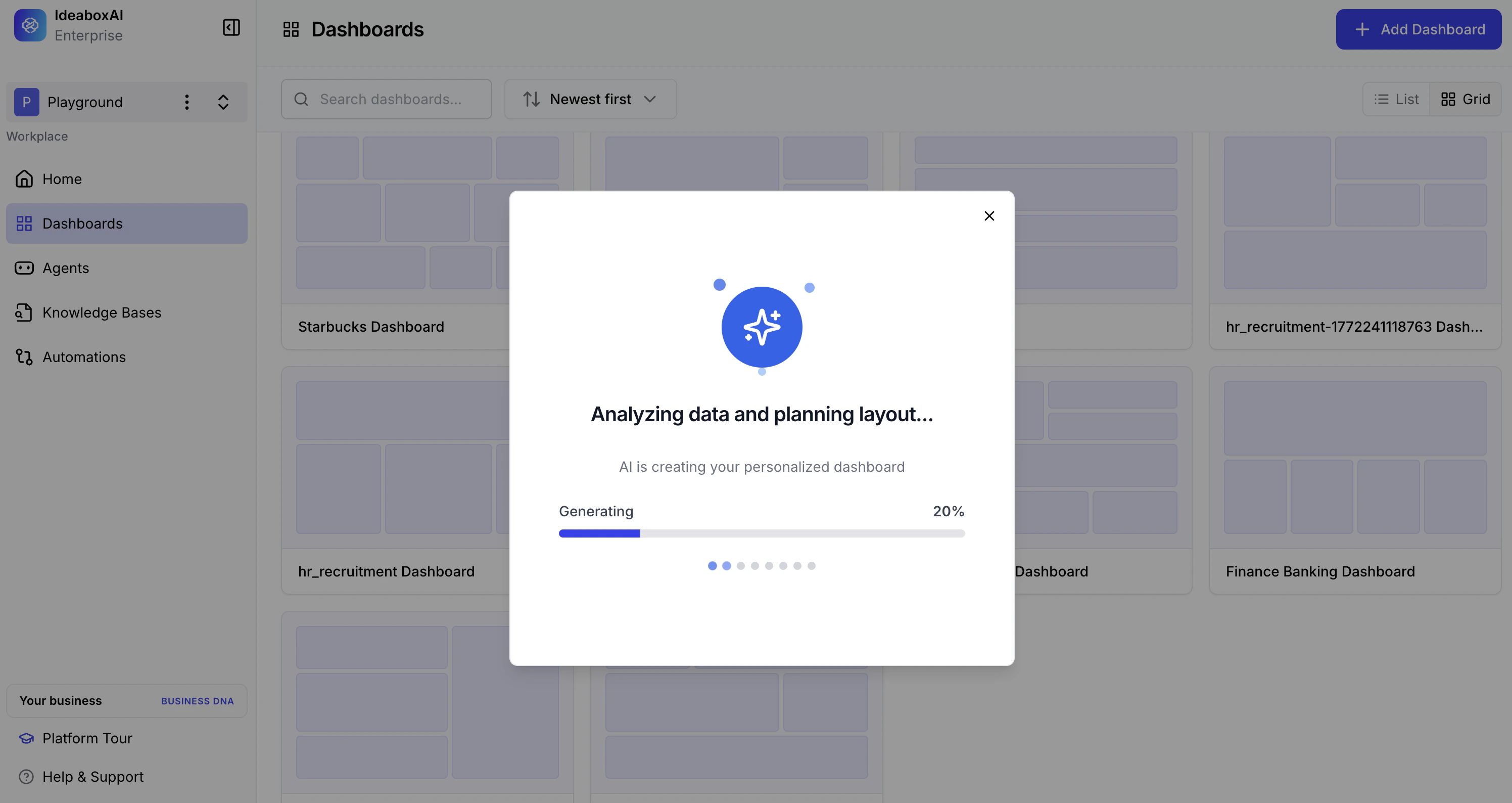
- Analysing the data schema
- Matching data against your custom instructions
- Building chart components based on the data
- Finalising the dashboard layout
Dashboard generation runs in the background. You can minimise the window and continue working elsewhere while it processes — especially useful for large files or complex schemas.
Reviewing your generated dashboard
When generation completes, your dashboard appears in the canvas with a full set of AI-selected visualisations.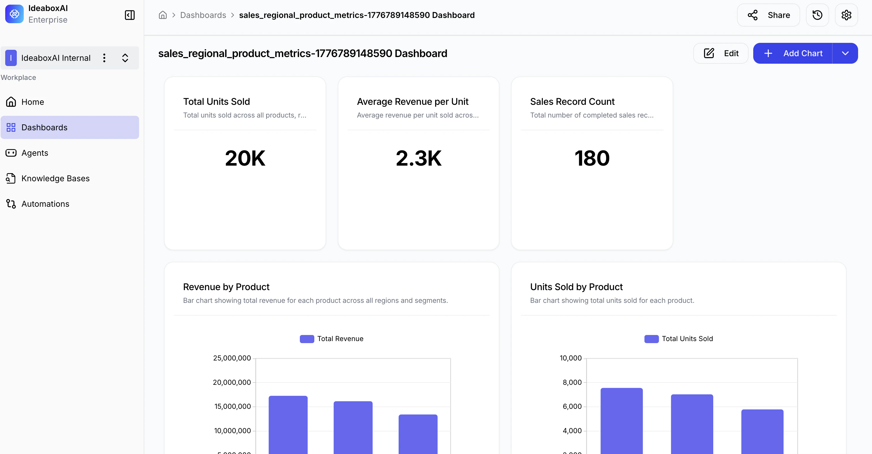
- KPI Summary Cards — High-level metrics displayed as large numeric values for immediate visibility.
- Charts and Visualisations — AI-selected bar charts, line charts, donut charts, and data tables covering the key metrics in your data.
- AI Insights — Click the Insights icon on any chart to view an AI-generated summary, highlights, business impact explanation, and calculation breakdown.
- Interactive Elements — Hover tooltips, clickable legends, and drill-down capabilities on all charts.
Cross-check AI-generated totals against your raw data source on the first run to verify the AI interpreted your requirements correctly. Refine your custom instructions and regenerate if needed.
Ready to go deeper? Explore the Tutorials section for step-by-step guides on sharing, alerts, the AI Assistant, chart insights, editing, and dashboard filters.