Dashboard filters let viewers segment and explore data on their own — filtering by date ranges, regions, categories, or any other dimension — without changing the dashboard structure.Documentation Index
Fetch the complete documentation index at: https://docs.ideaboxai.com/llms.txt
Use this file to discover all available pages before exploring further.
Accessing the filter menu
From the dashboard view, click Add filter in the top toolbar, or select it from the + Add Chart dropdown menu.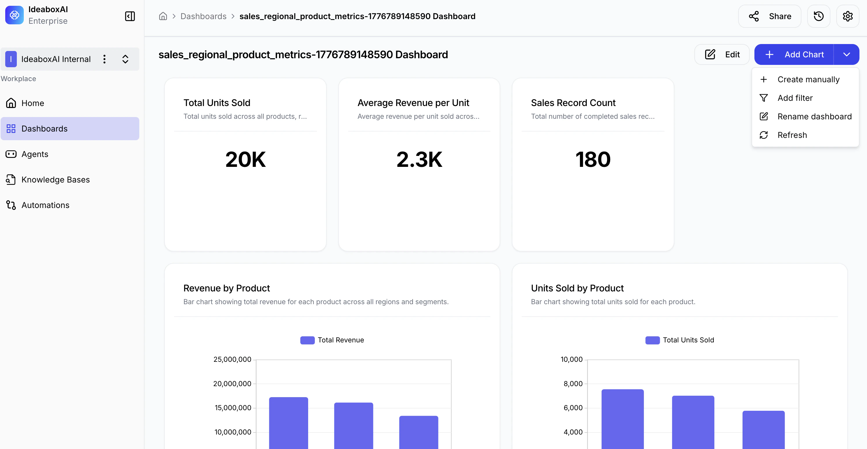
Creating a filter
The Add dashboard filter modal opens. Fill in the basic configuration: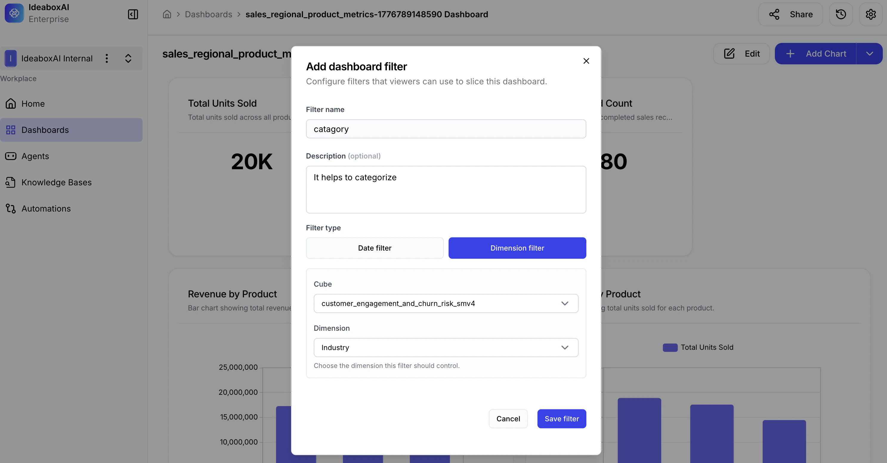
- Filter name — The label visible to users (e.g., “Region”, “Category”, “Date Range”).
- Description (optional) — A short explanation of what the filter does (e.g., “Filters all charts by industry segment”).
Selecting the filter type
Choose a type based on the kind of data you want to filter: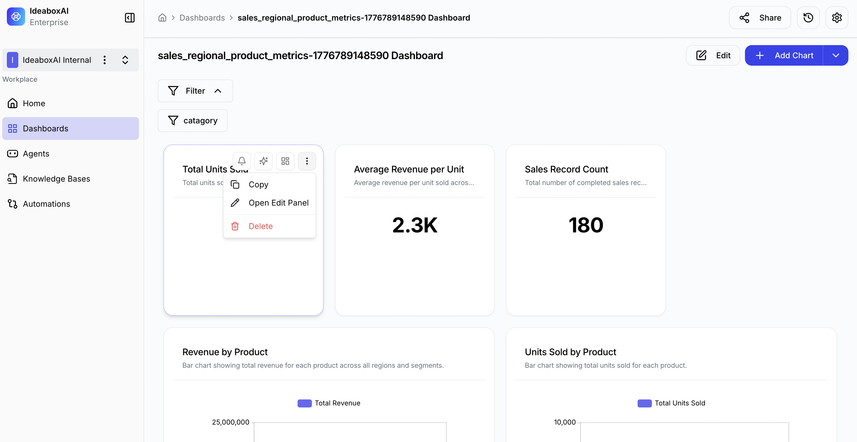
| Filter Type | Use Case |
|---|---|
| Date filter | Filter data by time periods — year, quarter, month, or day. |
| Dimension filter | Filter by categorical values such as Industry, Region, or Product. |
Selecting the data source
After choosing the filter type, select the data cube and dimension to filter on:
- Cube — Choose the data source that backs this filter (e.g.,
customer_engagement_and_churn_risk_smv4). - Dimension — Select the specific field to filter (e.g., “Industry”, “Region”, “Product Category”).
Confirming and saving
Review your configuration, then click Save filter.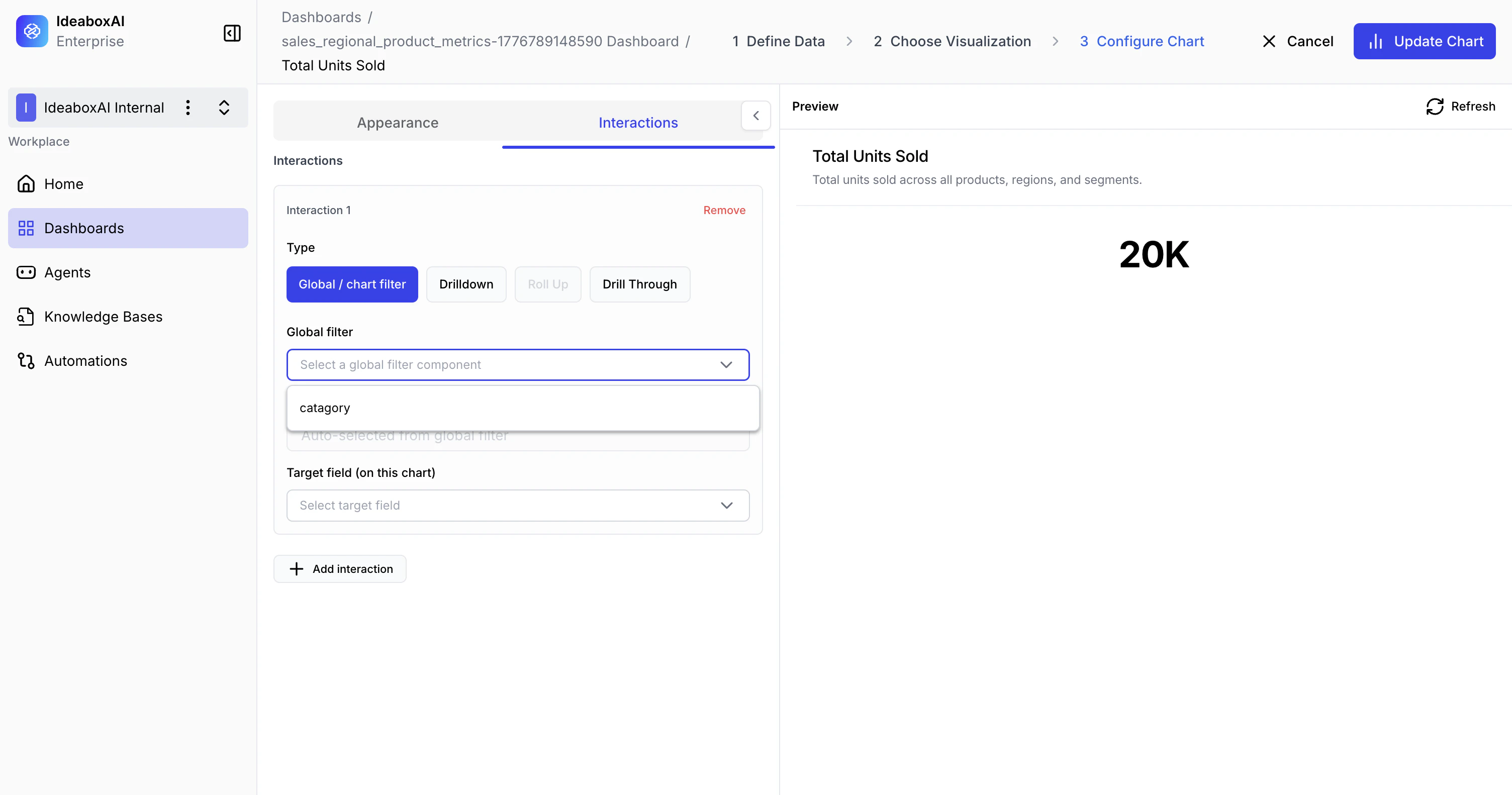
Filter appearance on the dashboard
Once saved, the filter appears at the top of the dashboard canvas.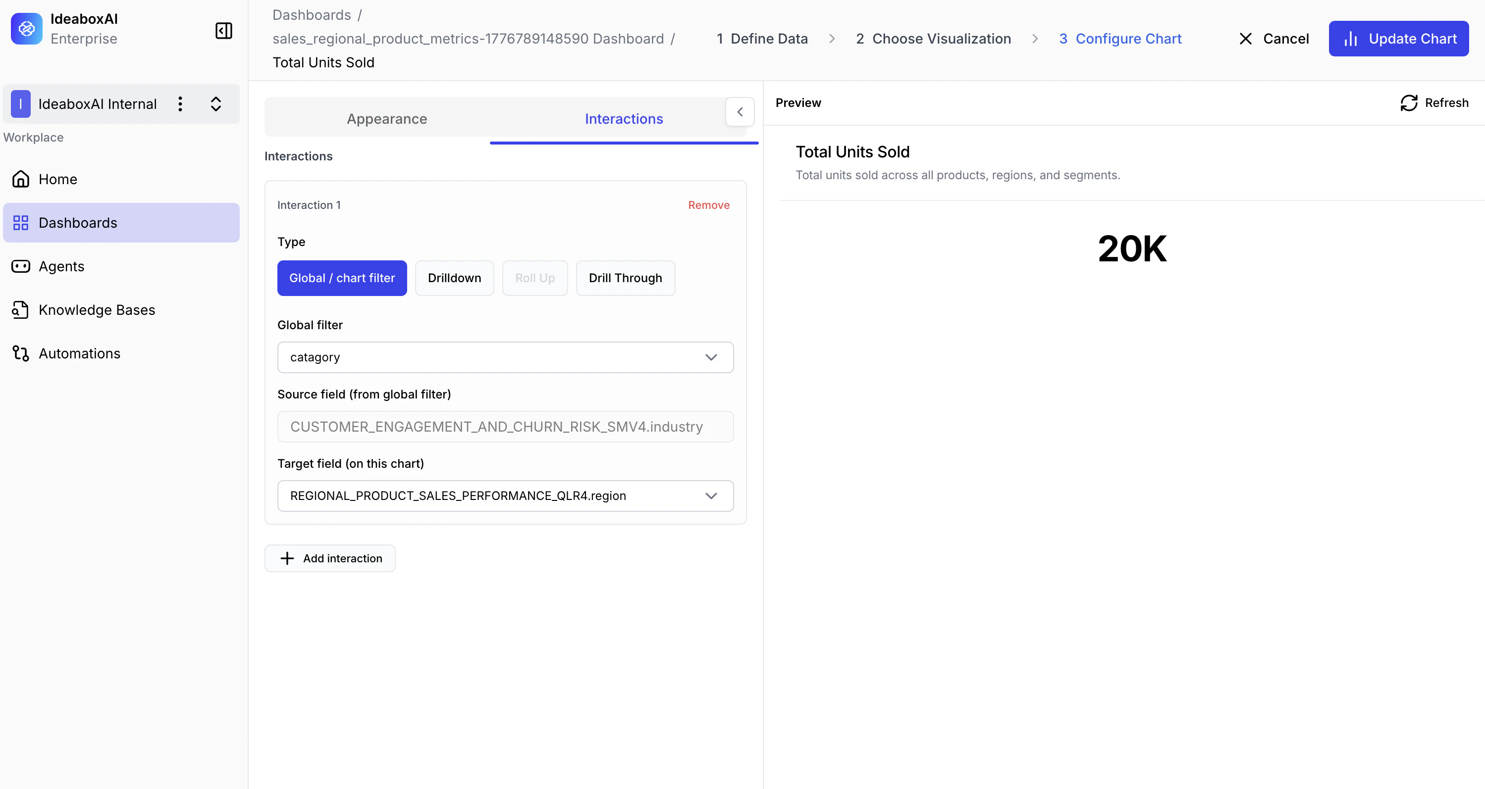
- Filter name — Identifies what is being filtered.
- Collapse / Expand — Toggle to show or hide the filter options.
- Three-dot menu — Access rename, edit, and delete options.
Interacting with a filter
Click the filter to expand it and select values: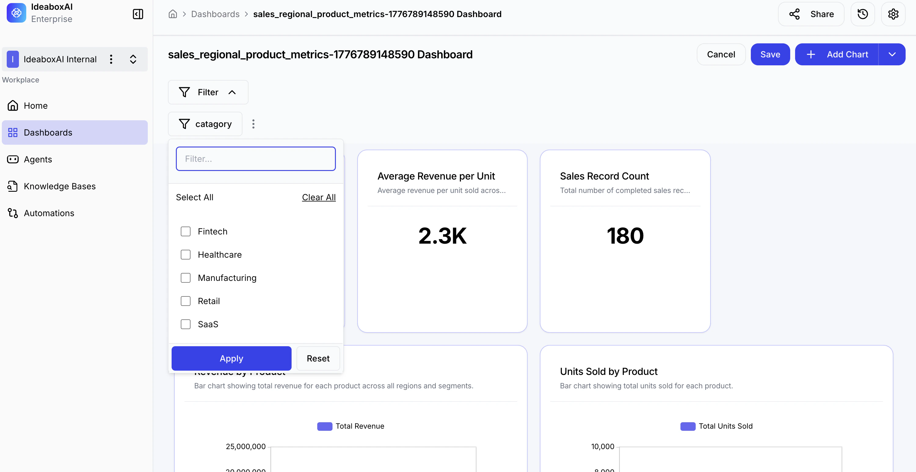
| Control | Action |
|---|---|
| Search box | Find specific values quickly (e.g., “Healthcare”, “Manufacturing”). |
| Select All | Check all dimension values at once. |
| Clear All | Deselect all values. |
| Checkboxes | Choose individual values to include. |
| Apply | Apply the selection and update all charts. |
| Reset | Clear selections and restore the unfiltered view. |
Using multiple filters
You can add as many filters as needed and apply them simultaneously for advanced data exploration.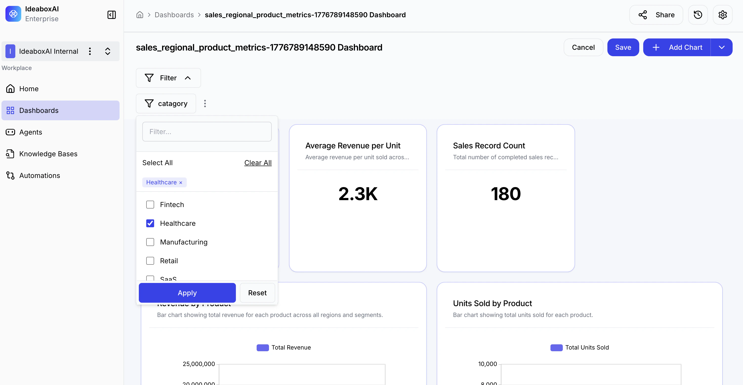
- All active filters appear in the filter bar at the top.
- Selected values are shown as badges or tags.
- All connected charts update to reflect the combined filter criteria.
Viewing filtered results
The dashboard updates dynamically as filters are applied: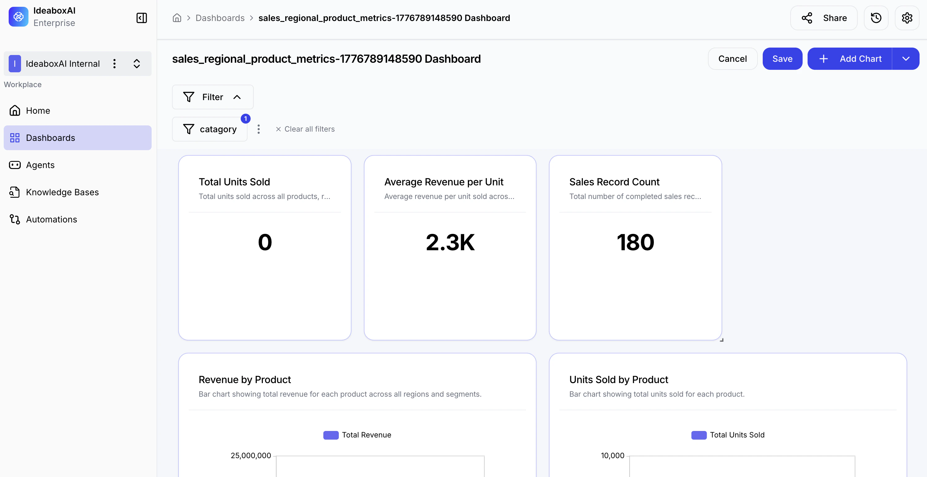
- KPI cards recalculate to show values for the filtered segment.
- Charts display data only for the selected categories.
- Filter badge shows a notification dot when a filter is active.
- Clear all filters restores the full unfiltered dashboard in one click.
Design filters around common user workflows. Group a time period filter with a region or category filter to support the analytical patterns your team uses most often. Use clear, descriptive names so viewers understand what each filter controls.