The Dashboard Settings panel gives you full control over the visual presentation of your dashboard. You can align it with your brand colours, choose a typography style, adjust spacing, and add your organisation’s logo — all with a live preview that updates in real time as you make changes.Documentation Index
Fetch the complete documentation index at: https://docs.ideaboxai.com/llms.txt
Use this file to discover all available pages before exploring further.
Opening Dashboard Settings
Click the settings icon in the top-right toolbar of any dashboard to open the Dashboard Settings modal. All styling options are grouped under the Styling tab.Primary Colour
Set your brand’s primary colour to apply across buttons, highlights, and interactive elements throughout the dashboard.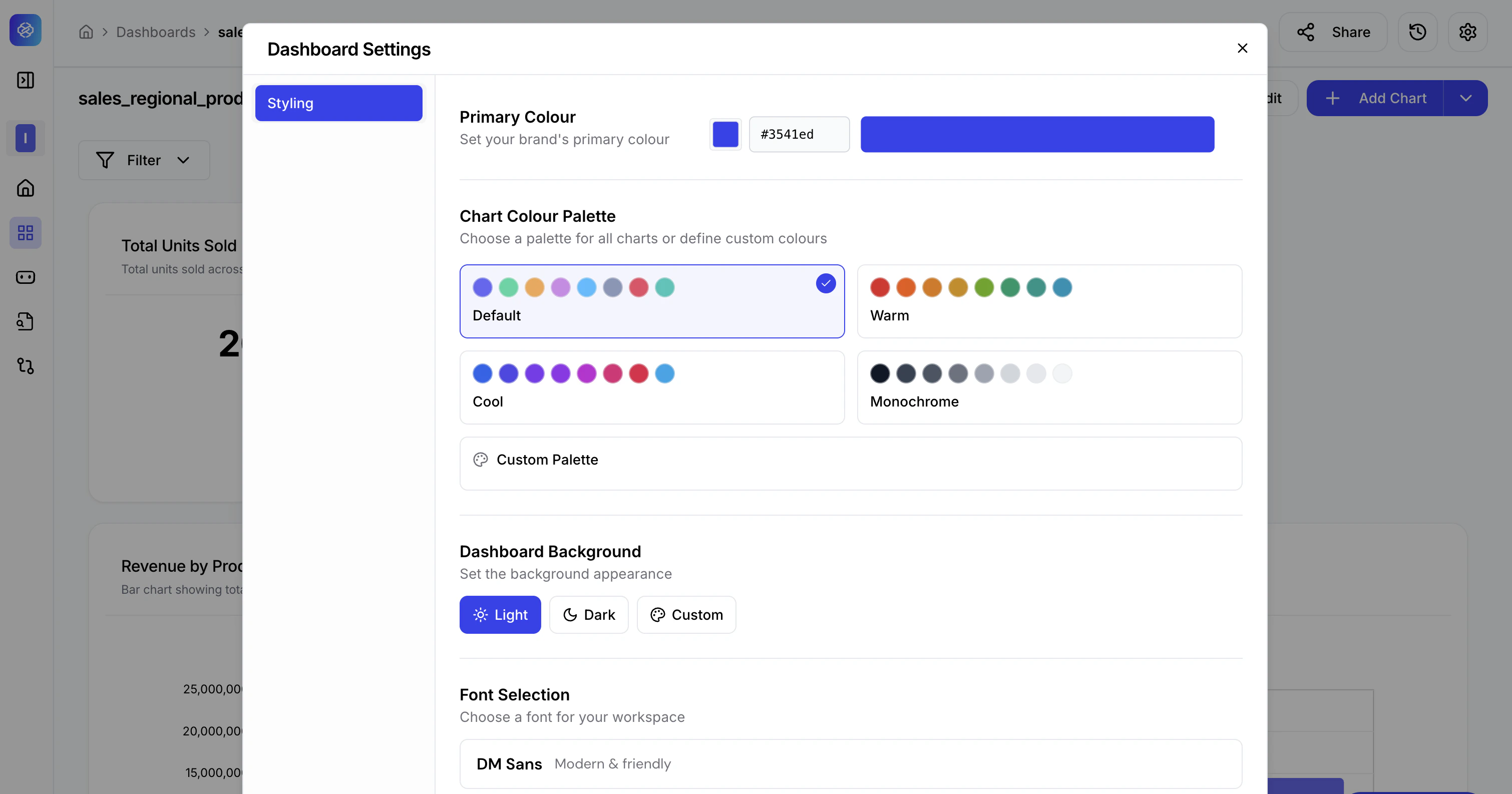
- Click the colour swatch next to Primary Colour.
- Enter a hex code directly (e.g.,
#3541ed) or use the colour picker to select visually. - The preview updates instantly to reflect your selection across all chart elements.
Chart Colour Palette
Choose how data series colours are applied across all charts in the dashboard.| Palette | Style |
|---|---|
| Default | Balanced multi-colour palette suitable for most dashboards. |
| Warm | Reds, oranges, and earthy tones. Ideal for energy, retail, or consumer dashboards. |
| Cool | Blues, purples, and teals. Works well for technology and financial dashboards. |
| Monochrome | Greyscale range for minimal, print-friendly presentations. |
| Custom Palette | Define your own sequence of colours to match your brand guidelines precisely. |
Dashboard Background
Control the overall background appearance of the dashboard canvas.- Light — White background. Recommended for presentations and reports.
- Dark — Dark background. Suited for operational monitoring screens or command centres.
- Custom — Set a specific background colour using a hex value.
Font Selection
Choose the typeface applied to all text across the dashboard — titles, labels, values, and tooltips.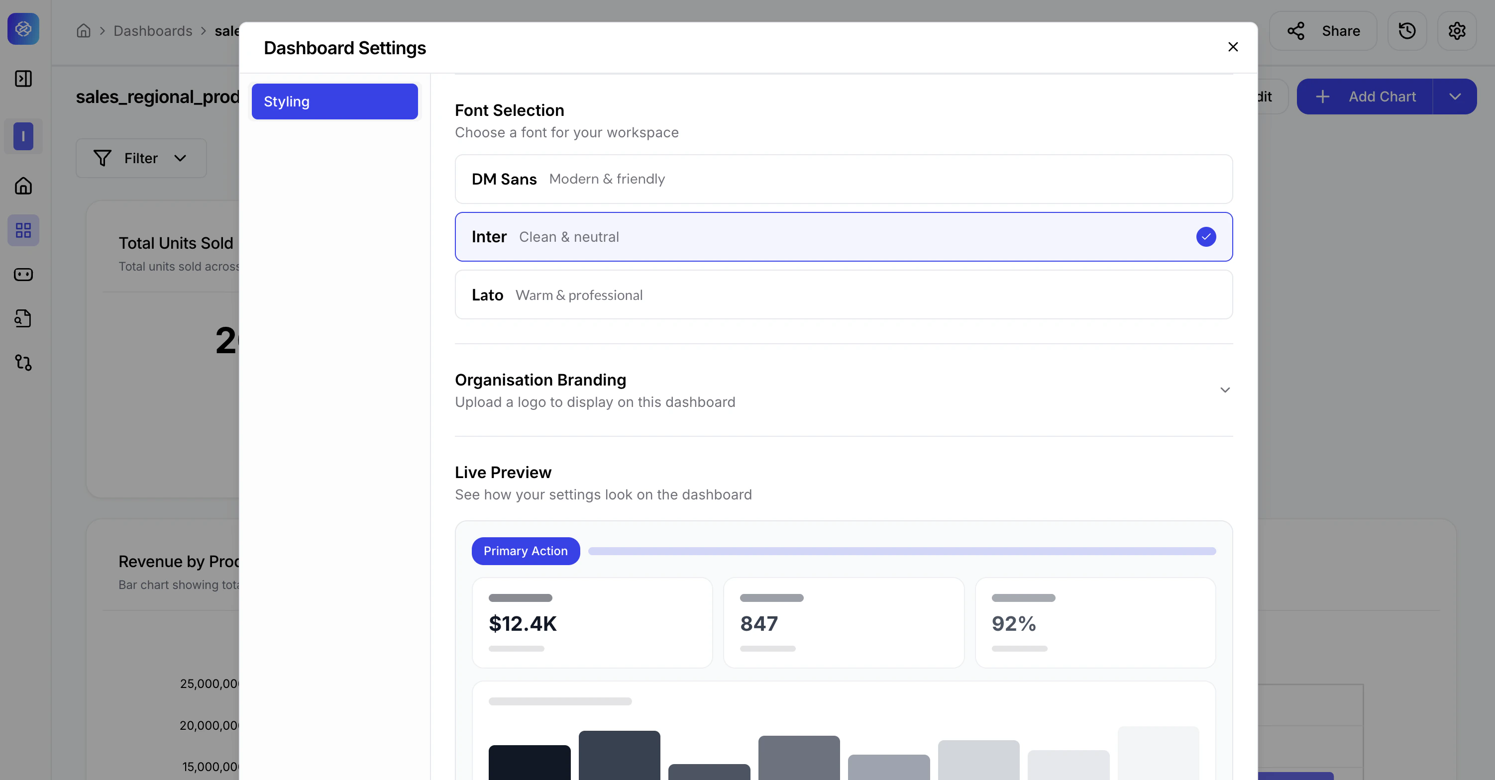
| Font | Character |
|---|---|
| DM Sans | Modern & friendly — approachable for general business use. |
| Inter | Clean & neutral — high legibility for data-dense dashboards. |
| Lato | Warm & professional — polished look for executive-level reports. |
Organisation Branding
Upload your company or team logo to display on the dashboard.- Click Organisation Branding to expand the section.
- Upload an image file (PNG or SVG recommended for best quality).
- The logo appears on the dashboard header, making it suitable for client-facing or embedded deployments.
Layout
Fine-tune the spacing and shape of chart cards on the dashboard canvas using the three sliders.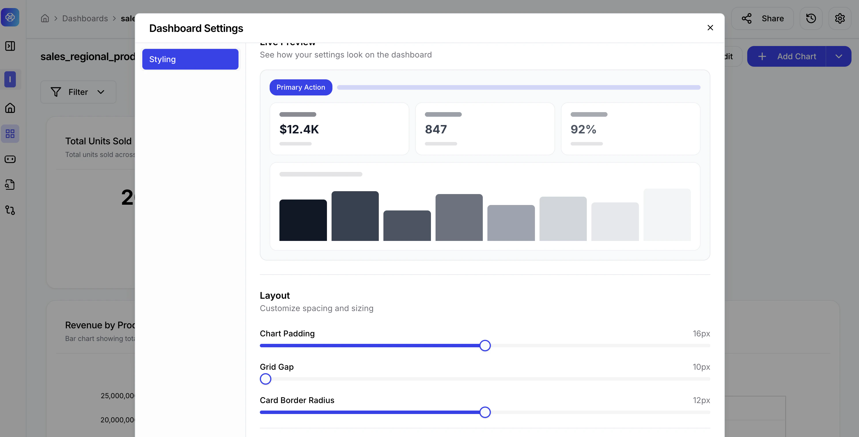
| Setting | What it controls | Default |
|---|---|---|
| Chart Padding | Internal spacing between chart content and the card edge. | 16px |
| Grid Gap | Spacing between chart cards on the canvas grid. | 10px |
| Card Border Radius | Corner rounding on each chart card. | 12px |
For client presentations, increase Card Border Radius to 16–20px and reduce Grid Gap slightly to create a polished, card-based layout. For dense operational dashboards, keep padding and gaps low to maximise data density on screen.