Every chart in an Agentic BI dashboard includes an AI-powered Insights panel. Clicking a chart opens a deep analysis that goes beyond the raw numbers — surfacing patterns, anomalies, business context, and recommended actions.Documentation Index
Fetch the complete documentation index at: https://docs.ideaboxai.com/llms.txt
Use this file to discover all available pages before exploring further.
Opening the Insights panel
Click on any chart or KPI visualisation in your dashboard. The Insights panel opens on the right side of the screen.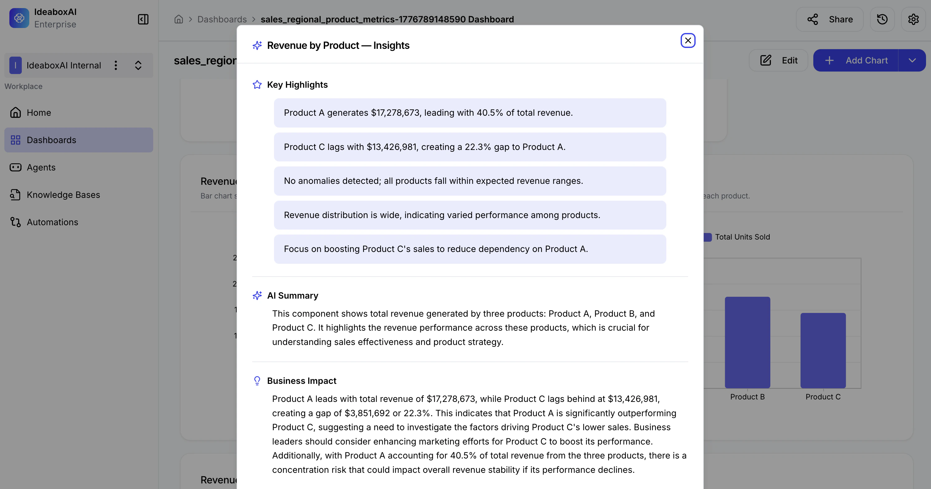
Insight sections
| Section | Description |
|---|---|
| Key Highlights | Bullet-point summaries of important findings, anomalies, and patterns. Quickly identify top performers, gaps, and outliers. |
| AI Summary | A narrative explanation of what the chart represents, its data composition, and its relevance to business performance. |
| Business Impact | Analysis of implications and recommended actions. Includes performance comparisons, risk assessments, and strategic recommendations. |
How to use insights effectively
- Before a presentation — Use the AI Summary to prepare a concise explanation of your data for stakeholders.
- During analysis — Use Key Highlights to quickly spot anomalies or outliers without manually scanning the chart.
- For decision-making — Use Business Impact to understand what the data means for your next steps.
- For sharing — Copy insight text to include in reports, emails, or meeting notes.
Use insights to validate assumptions before taking action. If the Business Impact section surfaces a risk or recommendation you hadn’t considered, revisit the underlying data to confirm before acting.