Build Canvas lets you curate a focused set of charts into a grouped view — pulling from existing dashboard charts or creating brand new ones with AI using natural language. Use it to build presentation-ready layouts, audience-specific views, or embedded chart collections without altering your full dashboard. The workflow moves through three steps: Select → Configure → Canvas.Documentation Index
Fetch the complete documentation index at: https://docs.ideaboxai.com/llms.txt
Use this file to discover all available pages before exploring further.
Opening Build Canvas
From any chart on your dashboard, hover over the chart header to reveal the toolbar icons, then click Build Canvas.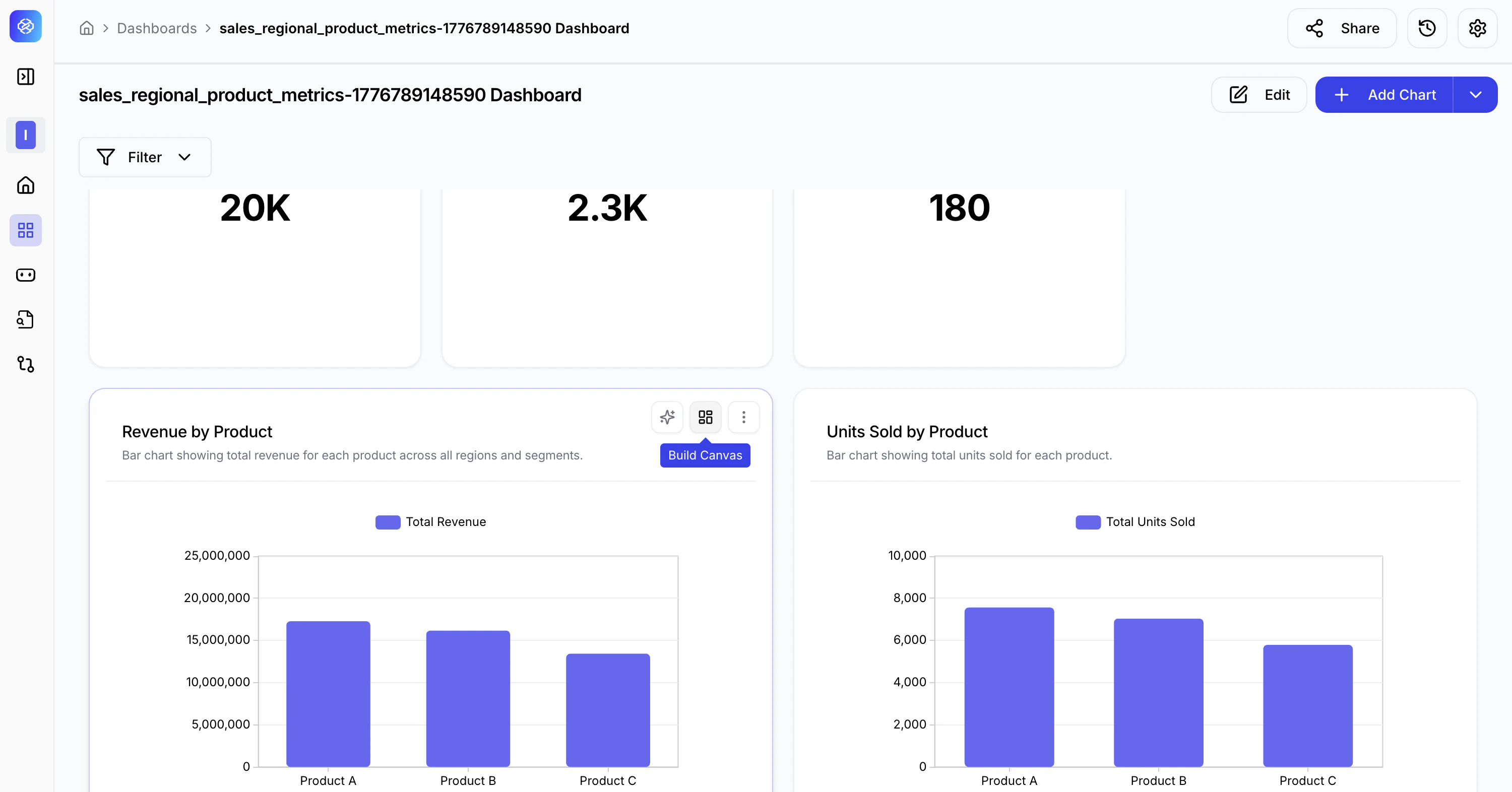
Step 1 — Select
Choose which charts to include in your canvas. You can pick from charts already on your dashboard, create new ones with AI, or do both.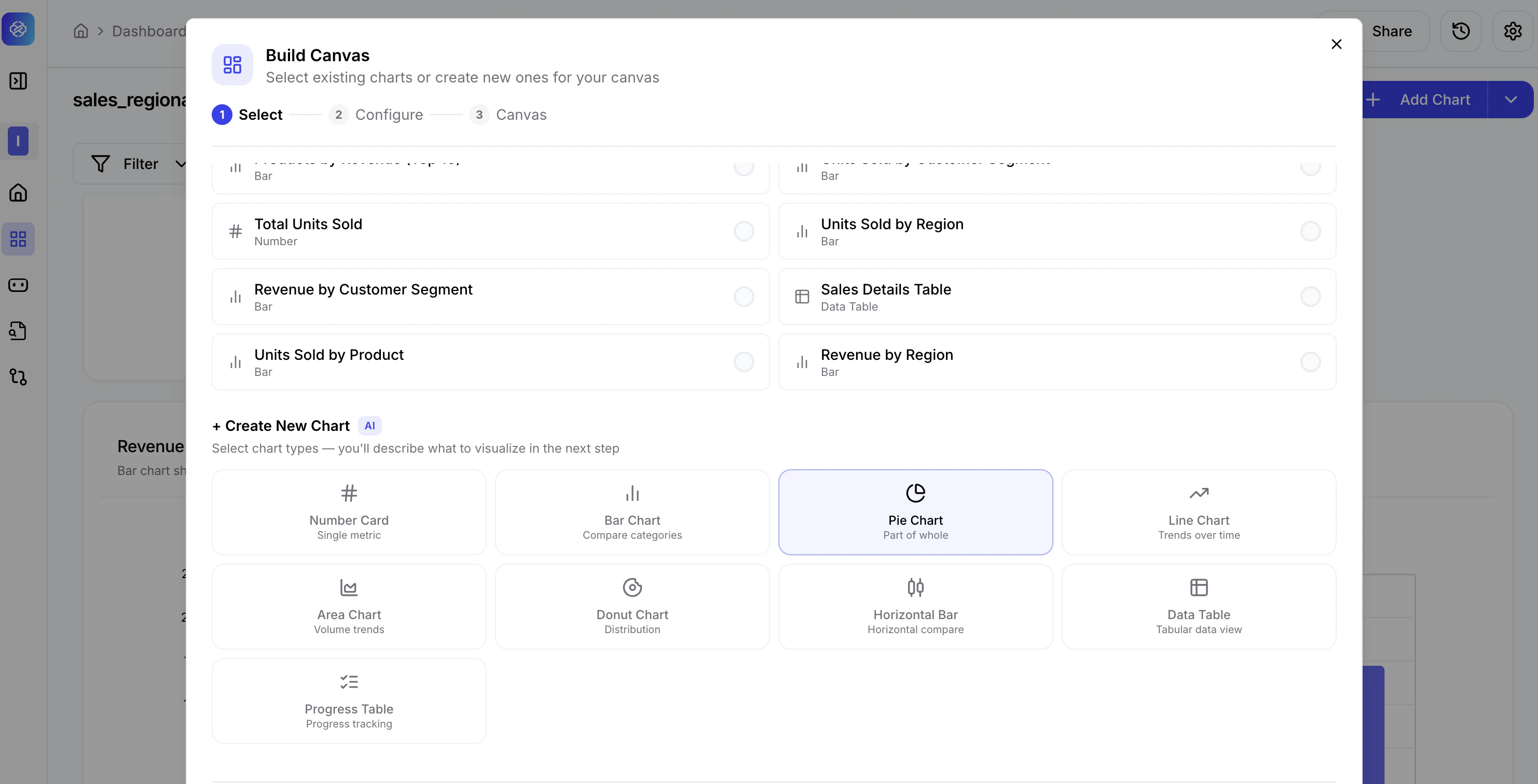
Selecting existing charts
All charts currently on your dashboard are listed under Dashboard Charts. Each row shows the chart name and type (Number, Bar, Data Table, etc.).- Click a row to select it — a filled blue circle appears on the right.
- Click again to deselect.
- Use the Search charts… field to find a chart by name quickly.
- The selection counter at the bottom right updates as you make changes (e.g., 1 selected, 6 selected).
Creating new charts with AI
Scroll down to the + Create New Chart section to add a chart that does not yet exist on your dashboard. Select a chart type and the AI will help you configure it in Step 2.| Chart Type | Best For |
|---|---|
| Number Card | Single KPI values — e.g., total revenue, record count. |
| Bar Chart | Comparing categories — e.g., revenue by product. |
| Pie Chart | Part-of-whole distributions — e.g., sales share by product. |
| Line Chart | Trends over time — e.g., monthly sales growth. |
| Area Chart | Volume trends over time with filled areas for emphasis. |
| Donut Chart | Distribution with a hollow centre — e.g., category breakdown. |
| Horizontal Bar | Side-by-side category comparison in horizontal layout. |
| Data Table | Tabular data view for detailed record-level display. |
| Progress Table | Progress tracking against targets or thresholds. |
Step 2 — Configure
This step applies only to new charts you selected in Step 1. Existing charts carry their configuration forward automatically.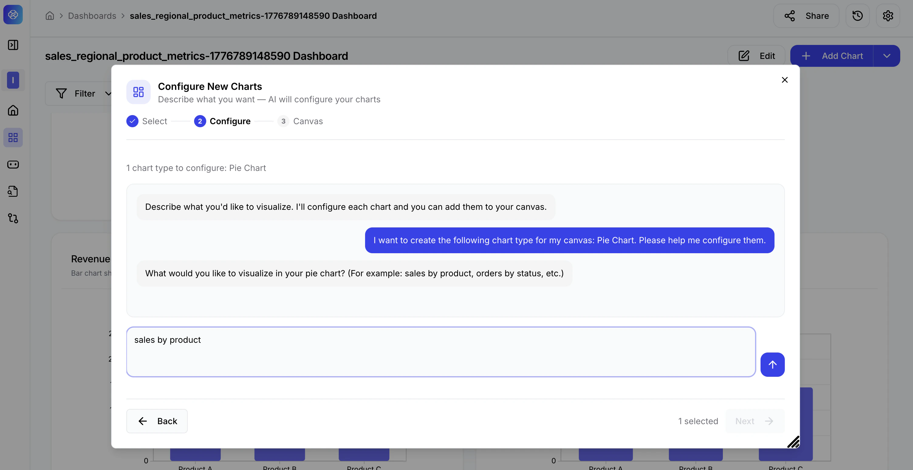
How the AI configuration works
- The AI greets you and asks you to describe what you want to visualise.
- Type a plain-language description in the input field at the bottom — for example, “sales by product” for a Pie Chart.
- Press Enter or click the send button.
- The AI generates a live chart preview based on your description.
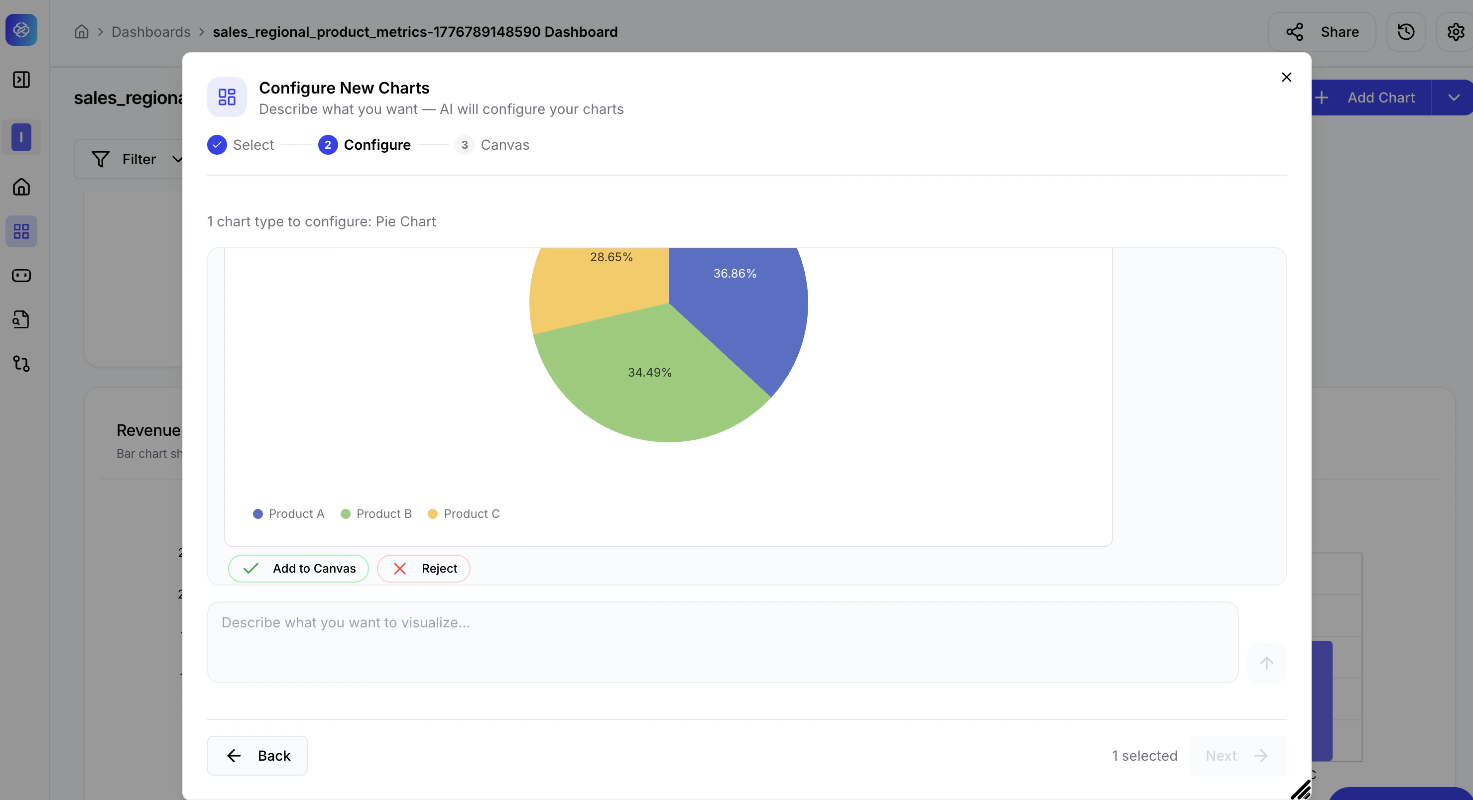
Reviewing the AI-generated chart
Once the AI builds the chart, a preview appears directly in the modal. Review it carefully, then take one of two actions:| Action | Description |
|---|---|
| Add to Canvas | Accept the chart and add it to your canvas. The chart moves to Step 3. |
| Reject | Dismiss this version. The input field remains active so you can re-describe and ask the AI to regenerate. |
If the first attempt does not match what you need, click Reject and refine your description. Be more specific — for example, instead of “sales by product”, try “percentage share of total sales for each product in the last quarter”.
Step 3 — Canvas
Review the final grouped view of all selected and newly configured charts before saving.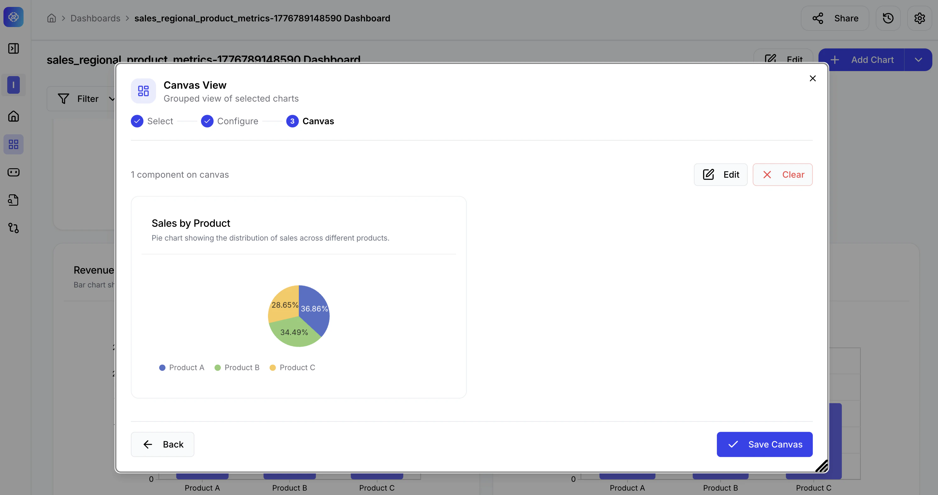
Canvas actions
| Action | Description |
|---|---|
| Edit | Return to the Select or Configure steps to adjust your selections or regenerate charts. |
| Clear | Remove all components and restart the selection. |
| Back | Go back one step without losing your current selections. |
| Save Canvas | Finalise and save the canvas view to your dashboard. |
Use Build Canvas to create audience-specific views without modifying the main dashboard — for example, an executive canvas showing only top-level KPIs and a product share breakdown, separate from the detailed operational view used by your team.