Agentic BI
Transform raw data into actionable insights with AI-powered dashboard generation and intelligent visualizations
Introduction
The Dashboards module in IdeaboxAI allows you to transform raw data from various sources into actionable insights. By leveraging Auto-Generated Boards, you can utilize AI to automatically design layouts and charts based on natural language instructions, significantly reducing the time required for manual report building.
Whether you're tracking supply chain metrics, analyzing sales performance, or monitoring financial KPIs, Agentic BI empowers you to create sophisticated dashboards without deep technical expertise.
Getting started
Navigate the dashboards workspace
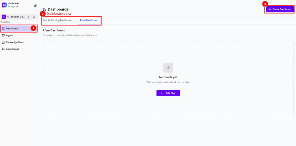
Access Dashboards in the sidebar to view your workspace's dashboard area. The interface consists of:
- Primary Sidebar - Navigation links for Dashboards, Agents, Knowledge Bases, and Automations
- Dashboards List - A horizontal tabbed view showing existing boards (e.g., "Supply Planning Dashboard")
- Canvas Area - The central workspace where charts and data visualizations are displayed
- Global Action Button - A + Create Dashboard button located in the top-right corner
Actions you can perform:
- Click on dashboard names in the tab list to switch between different views
- Click + Create Dashboard to start the setup wizard
- In an empty dashboard, click the central + Add Chart button to manually insert a widget
💡 Tip: Organize dashboards by business function (e.g., Supply Chain, Sales, Finance) for easier navigation and better team collaboration.
Best practices:
- Keep the number of active dashboards per workspace manageable to ensure high performance
- Use descriptive names that clearly indicate the dashboard's purpose
- Archive or delete unused dashboards periodically
Creating a dashboard
Connect your data source
When you click + Create Dashboard, a modal titled Connect Data Source appears with the following options:
- Create Mock Dashboard - Generates a board with sample data for testing
- Google Sheets - Integration for cloud-based spreadsheets
- CSV/Excel File - Options for local file uploads
- Knowledge Base - Connection to pre-processed internal data repositories
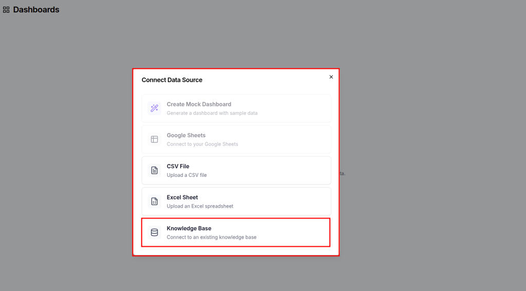
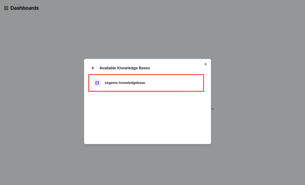
Select your preferred data source. If you choose Knowledge Base, a sub-menu appears listing available KBs (e.g., "azgems-knowledgebase").
Actions you can perform:
- Select the data source that contains the information you want to visualize
- Preview available knowledge bases before connecting
- Upload CSV or Excel files directly from your device
The system establishes a secure connection with the data provider and advances to the Dashboard Configuration screen.
⚠️ Warning: Ensure data files (CSV/Excel) are cleaned and formatted with clear headers before uploading. Poor data quality will affect AI-generated insights.
Best practices:
- Use Knowledge Bases for large-scale enterprise data to leverage pre-defined schemas and faster AI processing
- Test with Create Mock Dashboard first to familiarize yourself with the interface
- Validate data source connectivity before proceeding with dashboard creation
Configure AI-driven dashboard generation
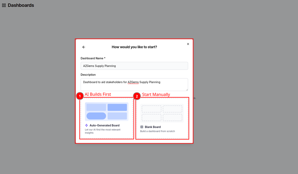
The configuration screen includes:
Identity fields:
- Dashboard Name (required) - A descriptive name for your dashboard
- Description - Explain the purpose and target audience
Starting options:
You have two distinct paths:
- AI Builds First (Auto-Generated Board) - AI selects the most relevant insights automatically
- Start Manually (Blank Board) - Build the layout from scratch with full control
For AI-powered generation, you'll see a Custom Instructions text area where you can guide the AI's focus.
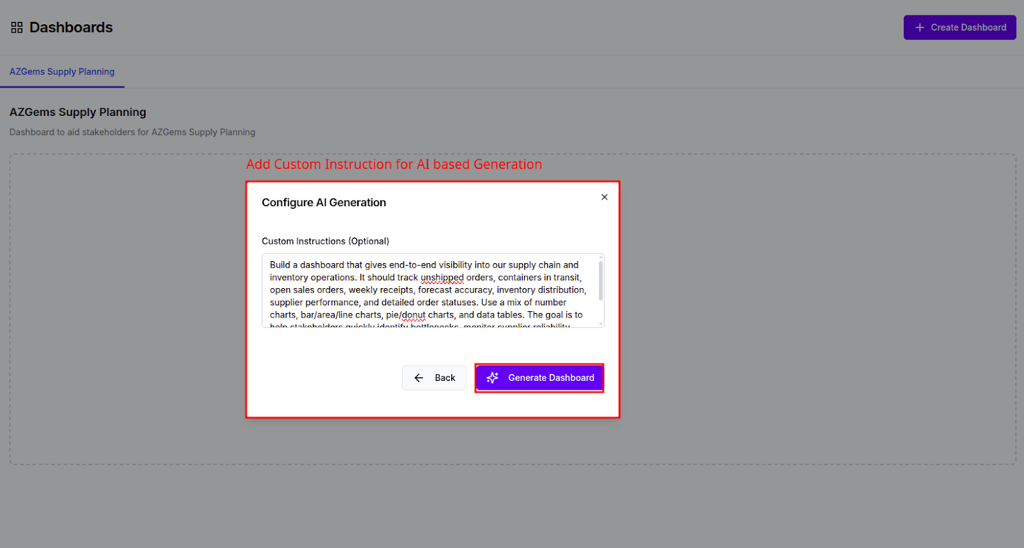
Example custom instructions:
"Track unshipped orders and container status using donut charts. Show inventory distribution by vendor and highlight critical shortage alerts."
Actions you can perform:
- Enter a descriptive name and purpose for the dashboard
- Select the AI Builds First (Auto-Generated Board) option
- Input specific requirements in the Custom Instructions field
- Specify preferred chart types, KPIs, and data filters
💡 Tip: Be specific in custom instructions. Mention exact KPIs (e.g., "Inventory distribution") and preferred chart types (e.g., "bar chart," "donut chart") to improve AI accuracy.
Monitor AI dashboard creation
Once you submit your configuration, the Dashboard Creation Agent begins working. You'll see a progress screen with real-time status updates:
- Analyzing the data schema
- Matching data against user instructions
- Building components based on the data
- Finalizing dashboard layout
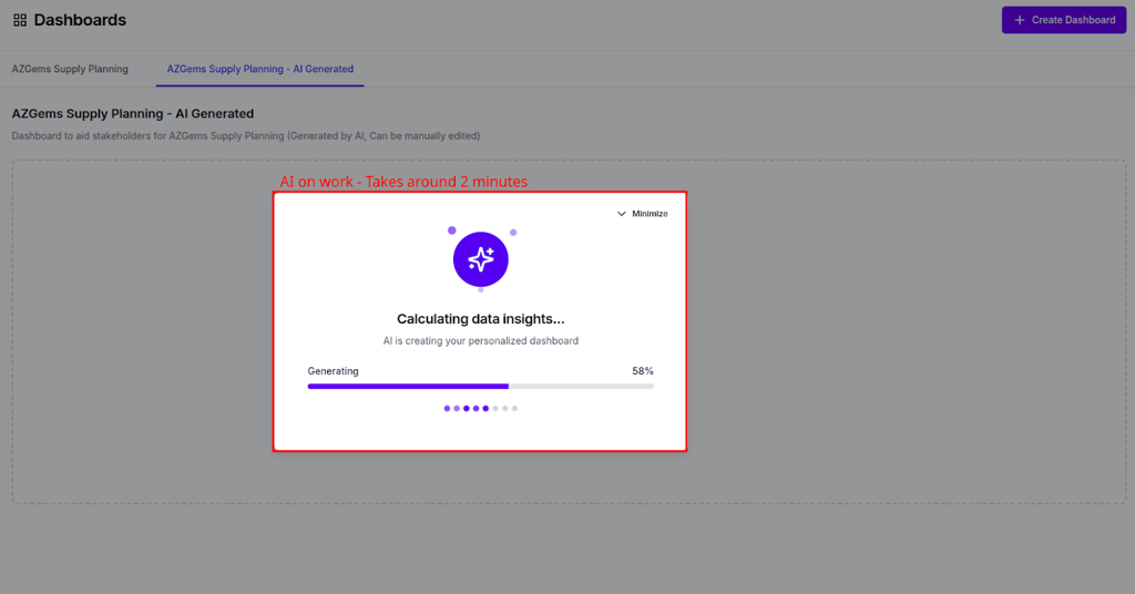
The AI analyzes your data structure, identifies key metrics, and automatically generates visualizations that align with your custom instructions.
Best practices:
- Provide context about stakeholders in the description field to help the AI tailor visualization complexity
- Start with broader instructions and refine in subsequent iterations
- Allow the AI to complete processing before making manual adjustments
Working with AI-generated dashboards
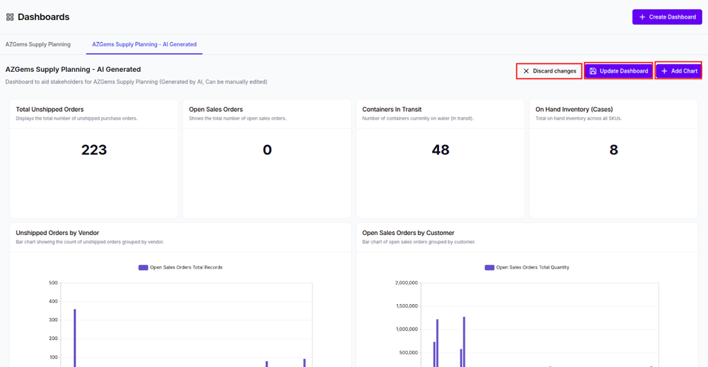
Review your dashboard
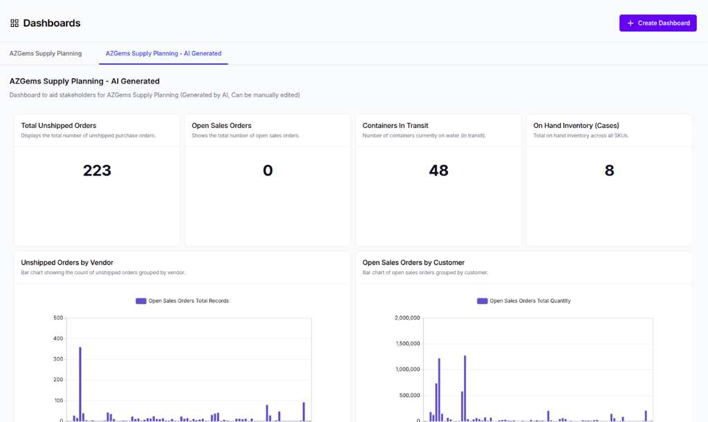
After generation completes, you'll see a fully functional dashboard with:
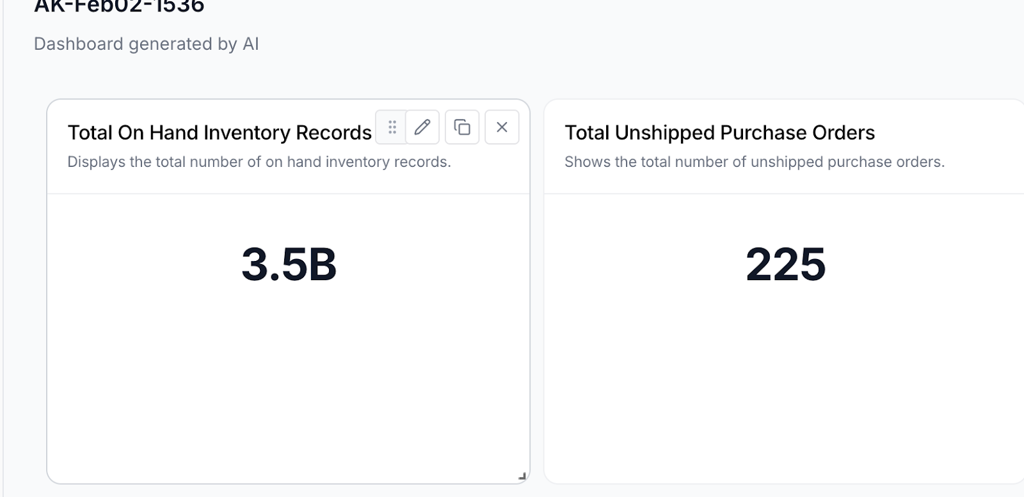
- KPI Summary Cards - High-level metrics displayed as large numeric values (e.g., "Total Unshipped Orders")
- Visualizations - Detailed charts such as "Unshipped Orders by Vendor" (Bar Chart) and "Open Sales Orders by Customer"
- Interactive Elements - Hover tooltips, clickable legends, and drill-down capabilities
Actions you can perform:
- Hover over chart elements to see specific data points
- Click on legend items to filter data dynamically
- Trigger data refresh to see the latest figures from the source
- Export visualizations for presentations or reports
Users receive a fully functional, interactive dashboard without manual widget configuration, and data insights are immediately visible for stakeholder reporting.
⚠️ Warning: Verify accuracy: Cross-check the AI-generated totals against the raw data source during the first run to ensure the AI interpreted your requirements correctly.
Best practices:
- Review all automatically generated metrics for accuracy
- Iterate: If the layout isn't perfect, use the manual edit mode to fine-tune chart types or filters
- Document any discrepancies and refine custom instructions for future dashboards
Managing dashboards
Access dashboard management options
You can manage existing dashboards through a contextual menu accessible via the three-dot icon next to the dashboard tab.
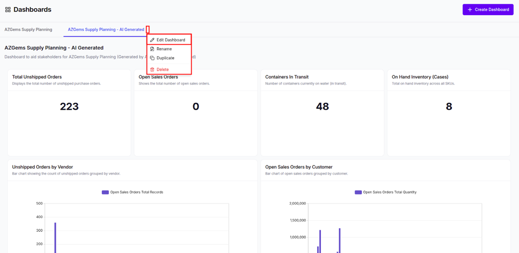
Menu options include:
- Edit Dashboard - Enter edit mode to modify layout and components
- Rename - Change the display name of the dashboard tab
- Duplicate - Create an identical copy for further iteration
- Delete - Permanently remove the dashboard from the workspace
Enter edit mode
When you select Edit Dashboard, a secondary header appears with action buttons:
- Discard changes - Revert to the last saved layout
- Update Dashboard - Save your modifications
- + Add Chart - Insert a new visualization

Actions you can perform:
- Rename dashboards to keep tabs organized as project scopes evolve
- Duplicate a stable dashboard before making significant layout changes
- Delete outdated or test dashboards to maintain workspace cleanliness
- Enter Edit Mode to enable interactive features for resizing and repositioning cards
💡 Tip: Duplicate a stable dashboard before making significant layout changes to ensure you have a backup. You can always delete the duplicate if you're satisfied with the changes.
Best practices:
- Use descriptive naming conventions that include date or version information
- Archive (duplicate and rename) dashboards before major restructuring
- Regularly review and delete unused dashboards to improve performance
Creating and configuring charts
Add a new chart
The Agentic BI platform allows for granular control over individual visualizations, either through manual selection or AI-assisted configuration.
In edit mode, click + Add Chart to open the Create New Chart modal. You'll see:
- Chart Title - A descriptive name for your visualization
- AI Instructions - Natural language input to guide chart generation
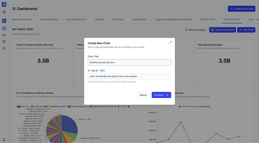
Example AI instructions:
"Show me monthly harvest by farm and species"
Define chart data
The chart creation workflow consists of three steps:
- Define Data - Select your data source and metrics
- Choose Visualization - Pick the appropriate chart type
- Configure Chart - Customize appearance and formatting
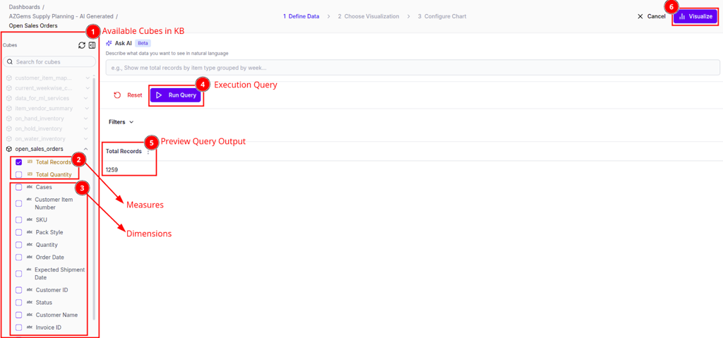
In the Define Data step, you'll see:
- Cube Selection Panel - A sidebar listing "Available Cubes in KB" with checkboxes
- Measures - Metrics to calculate (e.g., Total Records, Sum of Values)
- Dimensions - Attributes to group by (e.g., SKU, Status, Date)
- Preview Query Output - A data table showing results before visualization
Actions you can perform:
- Ask AI - Enter natural language queries to auto-configure data parameters
- Define Data Manually - Select specific cubes, measures, and dimensions from the knowledge base
- Run Query - Preview the data output before finalizing the chart
- Apply Filters - Narrow down results by date range, category, or other dimensions
💡 Tip: Start with AI: Use the "Ask AI" feature for complex data relationships and manually fine-tune if necessary. This approach combines speed with precision.
Choose your visualization
After defining data, you'll see a Visualization Gallery with recommended and general chart types:
- Number Cards - Large KPI displays
- Bar Charts - Compare values across categories
- Pie/Donut Charts - Show proportions
- Line Charts - Display trends over time
- Data Tables - Detailed tabular views
- Area Charts - Emphasize magnitude of change
- Scatter Plots - Show correlations
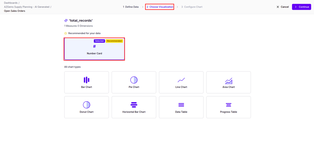
The system recommends chart types based on your selected measures and dimensions. Click on a visualization to preview how your data will look.
Best practices:
- Choose bar charts for comparisons and line charts for trends
- Use number cards for single KPI highlights
- Reserve pie charts for datasets with fewer than 7 categories
- Consider data tables when precise values matter more than visual patterns
Configure chart appearance
The final step allows you to customize the visual presentation:
Appearance options:
- Title - Edit the chart title text
- Title Position - Top, bottom, or hidden
- Value Unit - Add currency symbols or unit labels
- Format - Compact notation (1K, 1M) or full numbers
- Colors - Customize color schemes for different data series
- Fonts - Adjust title and label sizes
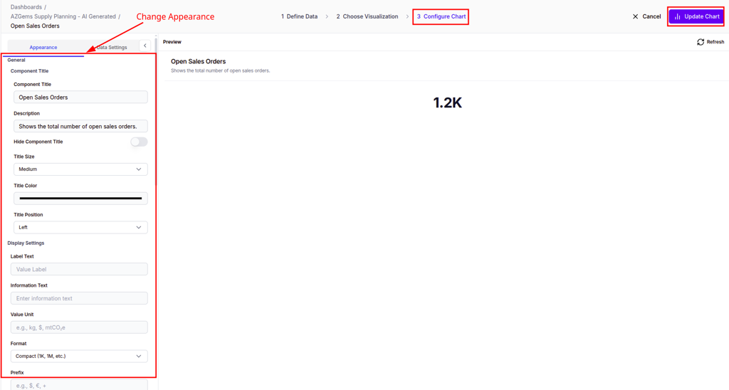
Actions you can perform:
- Adjust font sizes for better readability
- Customize title colors to match your branding
- Configure data formats for consistency
- Set value units (%, $, K, M) for proper context
Click Update Chart to apply all configuration and appearance settings to the card on the dashboard.
⚠️ Warning: Preview often: Always use the "Run Query" function to ensure the measures and dimensions selected return the expected data before finalizing the visualization.
Best practices:
- Standardize units across all dashboard cards to maintain visual harmony
- Use consistent color schemes for related metrics
- Keep titles concise but descriptive
- Test different chart types to find the most effective visualization
Optimizing dashboard layout
Arrange and resize cards
Dashboard cards are fully interactive in edit mode, allowing you to optimize the spatial arrangement of insights.
When you hover over a card, you'll see:
- Drag Handle - Move the card to a different position
- Edit Icon - Modify chart configuration
- Duplicate Icon - Create a copy of the chart
- Delete Icon - Remove the chart from the dashboard
- Resize Anchors - Small handles at the corners for scaling
Actions you can perform:
- Move - Drag cards to different positions on the grid
- Resize - Pull the card anchors to expand or shrink the visualization area
- Duplicate - Create variations of successful chart configurations
- Delete - Remove charts that don't add value
Save or discard changes
After adjusting your layout, you have two options:
- Update Dashboard - Save the new layout and make it visible to all users
- Discard Changes - Revert to the last saved layout without applying modifications
Adjusting card size may automatically re-scale the internal chart for optimal fit. Saving the layout ensures all stakeholders see the prioritized information first.
💡 Tip: Place the most critical "Number Cards" (KPIs) at the top of the dashboard for immediate visibility. Users typically scan from top to bottom and left to right.
Best practices:
- Group related charts (e.g., all vendor-related data) near each other to facilitate contextual analysis
- Use larger cards for complex visualizations that benefit from more detail
- Create a visual hierarchy with KPIs at the top and supporting details below
- Maintain consistent spacing between cards for a professional appearance
- Test your layout on different screen sizes before finalizing
Refreshing and sharing dashboards
Keep data current
Dashboards can be configured to refresh data automatically or on-demand:
- Manual Refresh - Click the refresh icon to update all visualizations with the latest data
- Auto-Refresh - Configure dashboards to update at regular intervals (hourly, daily, etc.)
Best practices:
- Set auto-refresh intervals based on data update frequency
- Use manual refresh for dashboards with expensive queries
- Communicate refresh schedules to stakeholders to manage expectations
Collaborate with your team
Share dashboards with team members by:
- Setting appropriate visibility levels (private, team, workspace-wide)
- Granting view or edit permissions as needed
- Embedding dashboards in other applications via iFrame
- Exporting static snapshots for presentations
⚠️ Warning: Review data permissions before sharing dashboards workspace-wide. Ensure users only see data they're authorized to access.
Next steps
- Knowledge Bases — Learn how to create and manage knowledge bases for your dashboards
- Agents — Learn how to create AI agents that leverage your knowledge bases